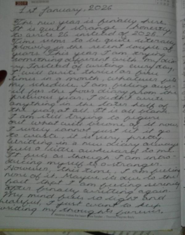
7/10. I have less of a problem with your handwriting and more with the image quality cuz it's absolutely horrendous also, on a side note, your handwriting looks prettier when looked on as one coherent piece than the individual words themselves, I fear you might need more practice in that regard...but still, it's all well imo since I'm certainly not the cursive police and how you write doesn't matter as long as your speech and meaning are conveyed perfectly
Pretty good darling but their are some room for major improvement like your letters are floating a bit specifically the "The" at the start. Your capital T's are not looped around correctly as far as cursive goes. Your capital I's are a bit indistinguishable from capital J's and your loops are not entirely uniform (specifically the lowercase loops) but don't you worry! Keep practicing and i am sure you'll improve significantly since it's pretty good to even start with (๑•ㅂ•)و✧
Btw, I am a calligraphy artist, practicing for about 8 years now. I specialise in cursive, copperplate and spencerenian! I also do a lot of block letters and flourish writing as well! If you have any doubts or want references, just dm me! Keep writing my love
Honestly, it looks nice and neat, but a little bit hard to understand. Maybe bc your letters seem to have the same length? Baseline letters shouldn't be equal to ascenders
thats lowkey the goal cause its my diary. BY CHANCE someone opens it, may they not be able to read anything Gojosbigshlong
it’s more likely that they won’t be able to read it because people are starting to forget how to read cursive , me included… but overall it’s nice, it’s giving the 19s
it’s more likely that they won’t be able to read it because people are starting to forget how to read cursive , me included… but overall it’s nice, it’s giving the 19s seabi



Messages
HOLYYYYYYYYYYYYYYYYYY THAT'S SO PRETTY
I love you. Lets get married
get in da carriage pooks i'm waitiiiiiiing ε=ε=(ノ≧∇≦)ノ
7/10. I have less of a problem with your handwriting and more with the image quality cuz it's absolutely horrendous also, on a side note, your handwriting looks prettier when looked on as one coherent piece than the individual words themselves, I fear you might need more practice in that regard...but still, it's all well imo since I'm certainly not the cursive police and how you write doesn't matter as long as your speech and meaning are conveyed perfectly
Awwie thanksss
Pretty good darling but their are some room for major improvement like your letters are floating a bit specifically the "The" at the start. Your capital T's are not looped around correctly as far as cursive goes. Your capital I's are a bit indistinguishable from capital J's and your loops are not entirely uniform (specifically the lowercase loops) but don't you worry! Keep practicing and i am sure you'll improve significantly since it's pretty good to even start with (๑•ㅂ•)و✧
Btw, I am a calligraphy artist, practicing for about 8 years now. I specialise in cursive, copperplate and spencerenian! I also do a lot of block letters and flourish writing as well! If you have any doubts or want references, just dm me! Keep writing my love
Actually i don't know any rules I copied the T from a font on google i liked a really long time ago. I'm gonna dm you for some references
Honestly, it looks nice and neat, but a little bit hard to understand. Maybe bc your letters seem to have the same length? Baseline letters shouldn't be equal to ascenders
8/10
Thankk youuuu
5/10
my eyes hurt, i fear i have lost the ability to read cursive
thats lowkey the goal cause its my diary. BY CHANCE someone opens it, may they not be able to read anything
it’s more likely that they won’t be able to read it because people are starting to forget how to read cursive , me included… but overall it’s nice, it’s giving the 19s
Love u. Im coming for you
This is my dream handwriting what you on about. It's perfect<3
I love you